Before and After for Danielle
If you want me to review your coaching website schedule some quality time with me here and we’ll find high-impact yet easy-to-do enhancements to improve your website for client-attraction.
Here’s one for Danielle Hall and her site is http://www.danielljehall.com.
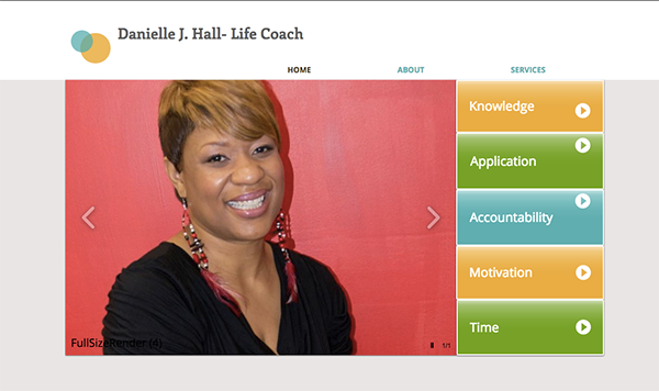
The Before

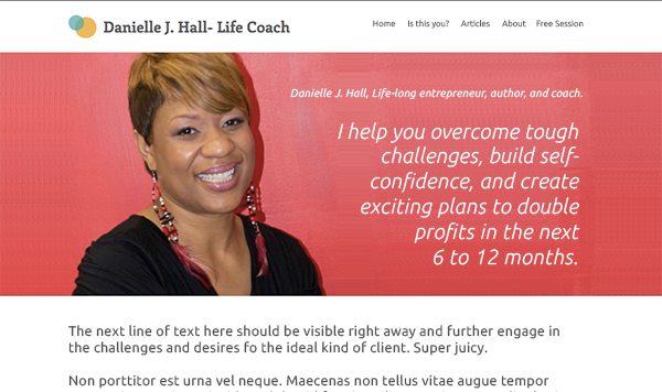
The Tweak
Great smile Danielle. I get nice feeling about you from your pic.
I’d make a big headline or opening statement that speaks about the benefits you bring clients. When people land on websites they need to instantly know, “What is this?” and even more so, “Why should I stick around” … that should be crystal clear. ANd on your site, right now, that isn’t apparent. I have to click and for every extra click, you’re going to lose people.
A quick tip on photos -> Take your photo outdoors or with natural filling the room and you won’t get that shadow on the wall look. Also, try turning off the flash. See this for getting a professional coaching photo.
The After


Thanks for the tip..
This is a great improvement. Lots of clarity in the services she offers. I am a student in one of your classes and I love how you format your core message. Lots of good vibration and energy.
Great tips, ma’ friend!
Yep, that’s crucial – “When people land on websites they need to instantly know, “What is this?” and even more so, “Why should I stick around” …”
That one little tweak alone can put $1000s (per month) in ones pocket!
Thanks for the shout-out to our group 🙂