Add Presence – A Website Tweak for Bill
Below is a website review for Dr Bill Goodman along with my before and after images to improve it. The main thing is to bring him up front and center. To make him powerfully present so that his visitors know there’s a master at work here.
His website is over here.
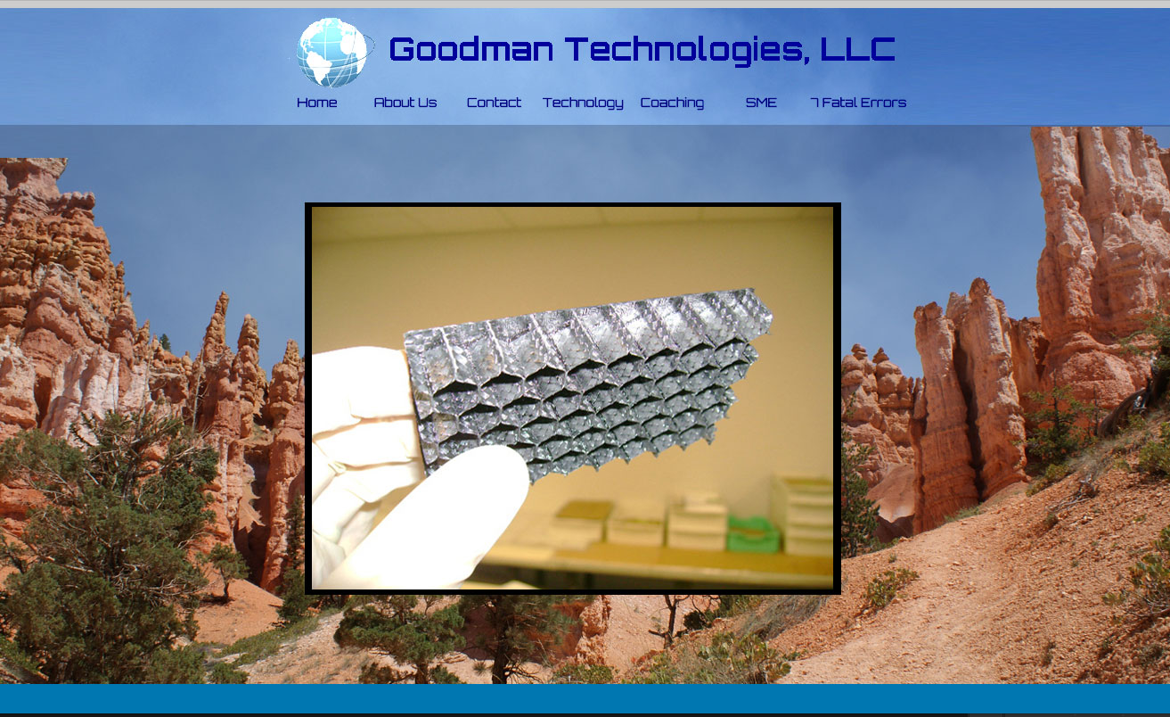
Here’s the before image …

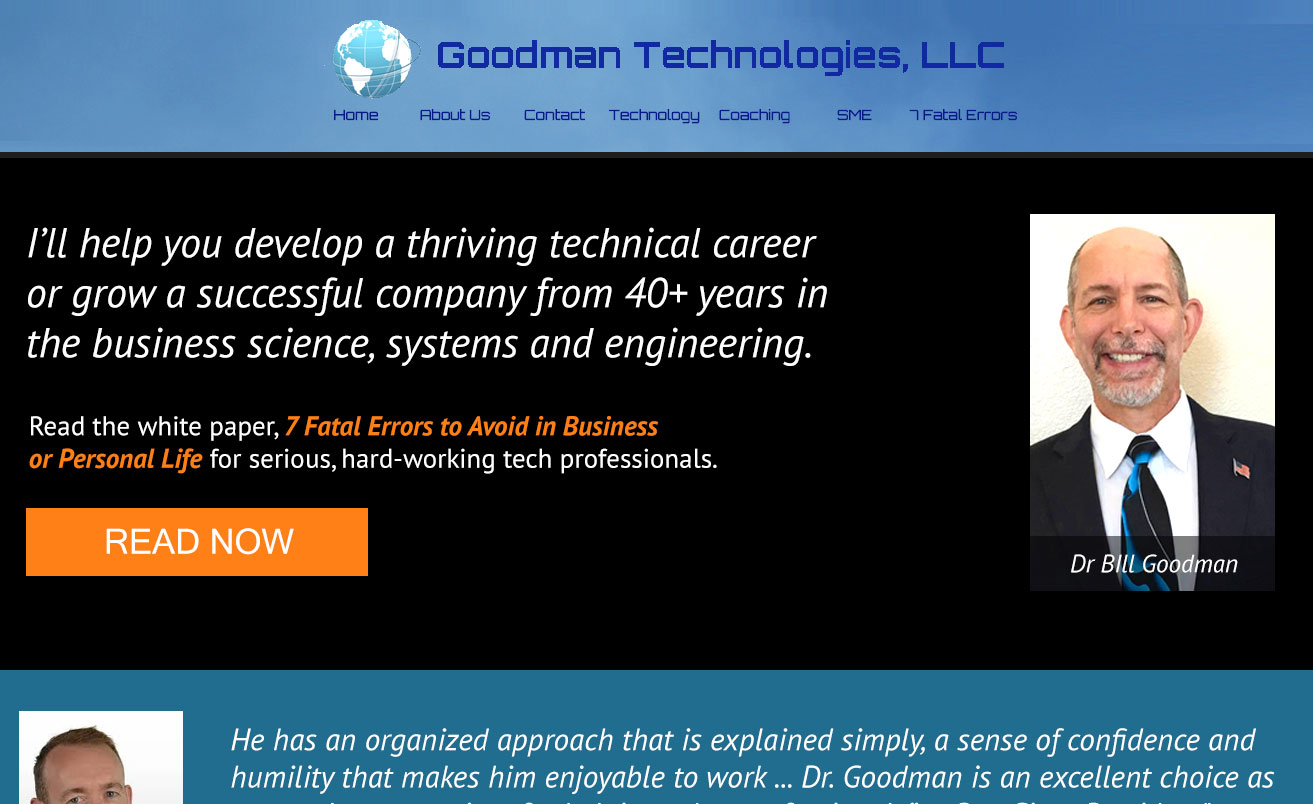
Here’s what I’d do to improve …
I like the simple menu at the top, not too long, not too short.
Also, I like your photo on the coaching page. It’s a great shot of you. Really make me feel there’s a good person (and real force) behind the site.
The tough part about your site is that you’re trying to offer both technology solutions and life coaching in one website.
Your site tries to bring it together in a message about “solving your problems” which is super general intangible for people to get.
You could split the home page into targeted messages. You could also create two separate websites for each type of client.
You could also just focus on one business/direction.
I’d personally make you think hard about your goals and desired future and what that is. And from that, figure out if growing both areas is the move, of how to split resources to both (often just complicates things 10x), and what to do with your website.
Assuming you’re a seasoned pro and you want to grow your coaching for a different kind of rewarding experience, I posted a redo of the home page below …
Also, you mentioned your problem is likely that your site only appears on page 44 of Google. And I’m assuming that you’re hoping that your site gets you some sales or leads as its main purpose.
To get that to happen, you’ll need to research keywords that (1) people are actually searching on and (2) if they search on those phrases, that your site will deliver the info these people want.
Then do a lot more “SEO stuff” to earn a high position on Google. Sadly that’s not a flip of a switch, but doesn’t have to take forever either. And it also might prove fruitless.
Here’s an article on keywords that can help and my rule to think savvily about SEO.
Also, the modern website design trends would be highly recommended for looking good on mobile devices, and for fonts that make sites easy to read.
Though, personally, I’d focus on getting your face and message up front and center first.
Here’s the after image …

What do you think? Got an idea to improve? Post it below.
[fblike]


Woops! Yes. Thanks Pat.
For the headline, do you mean “the business OF science, systems, and engineering”? Or is “business science” a thing that I’m not familiar with? I’m having a hard time parsing it. Nice new site though, I really like it.