Coaching Website Tips for Michael Toller
I’ve been reviewing coaching websites on LinkedIn. If you want yours reviewed, find me on LinkedIn and post your site.
If you’d rather not wait, then schedule some quality time with me here, and we’ll find high-impact yet easy-to-do enhancements to improve your website for client attraction.
Below are comments I’ve shared on LinkedIn for coach Michael Toller.
The aim is to improve it to attract clients.
The site is at: http://www.michaeltollercoaching.co.uk/
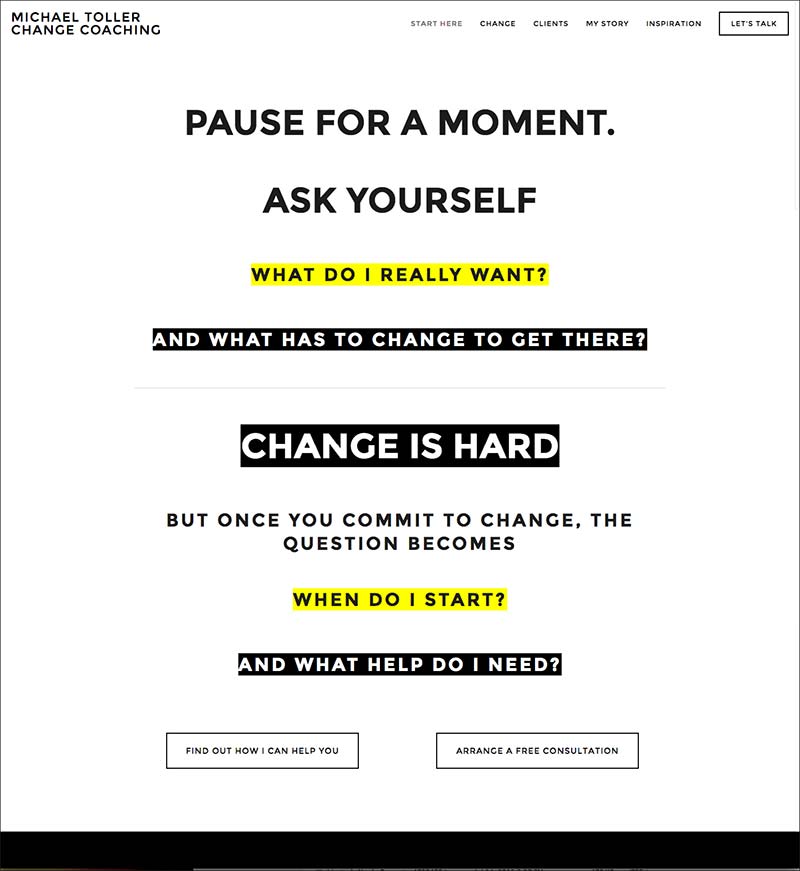
Here’s a screenshot of the home page right now:

Love the look because I’ve never seen something like that. Well, maybe once or twice.
I like the white space and that it speaks to the visitor directly, simply.
The simple menu is excellent as well. Nice.
I think the message can be stronger in a few different ways: honing in on “more ideal clients” who you’d love or even honing in on the pain with “change.”
Stuff like, “Been stuck for years and endless failed attempts to make changes, and it’s starting to feel hopeless?” … this speaks deeper to aspects of change.
If you want clients from the web, are continuously willing to pay your higher fees and are extremely excited to talk to you (like pre-sold), then your site and related materials (emails, freebies, offers) need to aim high.
But, in the end, you’ll need to (1) put in place a smart client-attraction strategy and (2) test out your website and strategy and see what numbers are actually happening.
Also, I bet you have a rockstar success story somewhere you should get into the client’s page.
That would speak greatly about you.
It’s entirely possible you give a kick-ass speech, and from that, you get 10 visitors to your site, and all of them call you – they are strong referrals.
It’s also possible your site gets 100 visitors from very casual people checking you out, who don’t know you too well, and none take action.
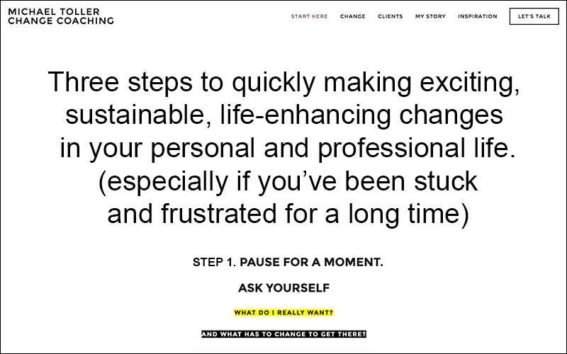
I did a quick screenshot to start you in the direction of the headline being more into aspects of change (and not just change). Also, you’ll see the “3 Steps” bit, which gives people something to expect in the content – it drives them to read more.
Again, in the end, you’ll need to get traffic and test it out.

Comments and thoughts are very welcome.
