Good Colors for Coaching Websites – Trust, Optimism, Positivity Faster
Trying to find the best colors for your coaching website and business? Need a good color scheme for your business? Want the right vibe for your coaching brand?
Yikes! When the colors are off, you know it immediately. Bad colors make websites painful to look at, and you resist going further.
But when the color scheme is working well, boy Oh boy! can it bring a website to life.
The Best Colors for Your Coaching Business (Niche)
You’ll see specific coaching niches have certain colors — like warm reds for relationship coaches and various blues for business coaches. That’s because they work.
And again, you know there’s a problem when the colors are just wrong, like:
- Black, grey, and brown won’t work for a health coach — who wants people to feel healing, strength, or vibrance.
- A gumball machine of bright playschool colors will feel off for a finance coach — who wants people to feel responsible, smart, and serious.
- A coach’s website filled with exciting, WOWing, dream-building words, but drab with muted bland colors, which will make you’ll feel conflicted.
You can certainly break away from the norm, but I rarely see anyone pull it off properly. More so, I see messes. Which is why I made the list below.
Research, Experience, and Marketers All Say That Good Colors are …
They all say colors are important. They matter.
I’ve read quite a few user-experience and marketing books in 20+ years as a web designer. I’m often reminded that we make decisions based on emotions and justify them with logic. Color is one element that works on our emotions.
There’s also a lot of research about it too. Here’s Google’s list. I read once, that the greens and blues that come into our eyes from being out in nature create a physiologically healthy response.
I trust the wise folks.
But I KNOW from experience that if the colors work well, the websites come to life. And I DEFINITELY know when colors are totally off, which is common among coaches who build their own sites – DIYers).
Ok, enough said. Let’s dive into the colors …
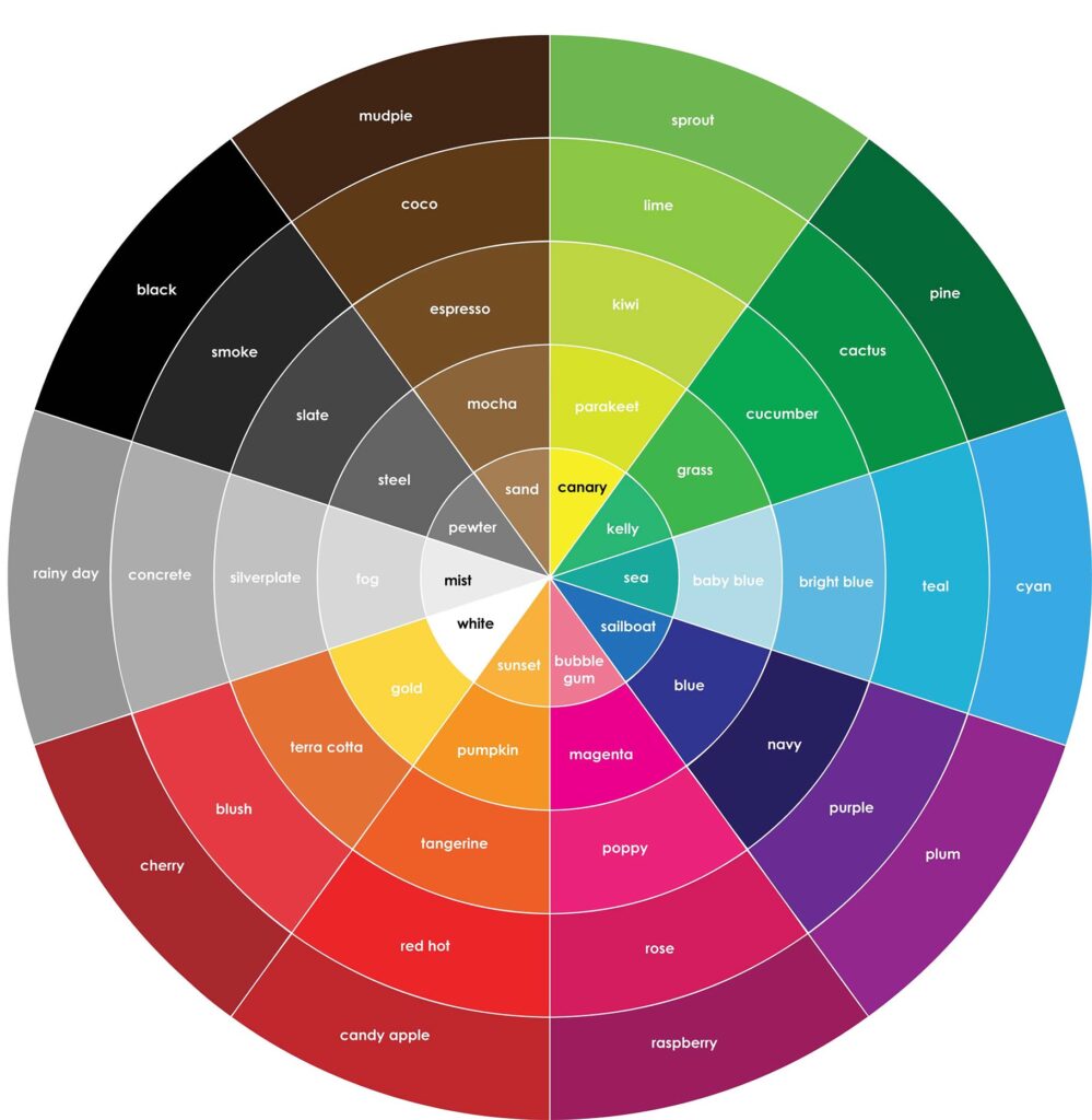
In this post, 8 categories to find good colors for your coaching website and business brand.
Here’s a list of colors:
- Orange for Energy and Enthusiasm
- Yellow for Optimism and Happiness
- Green for Growth and Balance
- Blue for Trust and Stability
- Purple for Wisdom and Spirituality
- Red for Passion and Power
- White for Simplicity and Positivity
- Black for Power and Strength
At the end are a few examples of websites and colors on coaching websites and how they support the brand and message.
AND! I’d love to hear from you in the comments. Tell me which colors do you like most?
1. Orange for Energy and Enthusiasm
Orange relates to these feelings, concepts, and words:
- energy, enthusiasm, attention, happiness, optimism
- fascination, creativity, determination, attraction, success, encouragement
- stimulation, heat, vitality, inviting, friendly, invigorating effect
- mental activity, young people, strength, endurance
- red-orange: desire, sexual passion, pleasure, domination, aggression, action
- gold-orange: prestige, illumination, wisdom, wealth, high quality
As a health coach, imagine a zesty, boisterous, brimming orange that makes visitors hungry for knowledge, happy, and alive. If their wellness is waxing and waning or they face serious health issues, they’d start feeling how great it is to be around you.
2. Yellow for Optimism and Happiness
Yellow relates to these feelings, concepts, and words:
- laughter, hope, sunshine, energy, optimism, cheerfulness, joy
- joy, happiness, intellect, warmth, cheerfulness, mental activity
- leisure, lightheartedness, children, spontaneous, freshness
As a “find meaning in your life” coach, how great would it be if your visitors who were in the dark, struggling with existential questions, and feeling down could feel lighter, more hopeful, and alive?
In addition to choosing the best colors for your coaching business website, make the structure, content, and calls-to-action encourage visitors to reach out to you. I wrote about this in The Coaching Website Guide. Have a look.
3. Green for Growth and Balance

relates to these feelings, concepts, and words:
- health, new beginnings, wealth
- ease, relax, create balance, growth, security, possibility, spring
- calm, anticipation, hope, soothing, relaxed, diet, control anxiety
- stability, endurance, discipline, harmony
- nature, freshness, fertility, safety, healing power, restful eye
- hope, positivity
Greens and blues are winners for most coaches’ websites because they are associated with growth and trust.
4. Blue for Trust and Stability
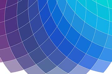
Blue relates to these feelings, concepts, and words:
- calmness, spirituality, security, trust, and professionalism.
- cool, tranquility, sincerity, cleanliness, pure
- stability, loyalty, wisdom, confidence, intelligence, faith, truth, heaven
- water, sea voyages, consciousness, intellect, high-tech
- masculine, males, appetite suppression
- health, healing, relaxation, understanding, and softness
- knowledge, power, integrity, seriousness, depth, expertise, stability, corporate
Blue is common in the corporate/professional world. Mixed with black, it can be a powerful combo.
Blue is often paired with analogous (nearby on the color wheel) greens and purples and opposite colors like orange/hot reds.
5. Purple for Wisdom and Spirituality
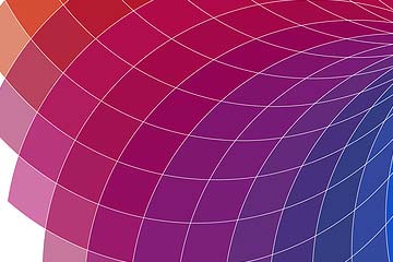
Purple relates to these feelings, concepts, and words:
- creativity, royalty, wealth, soothe, calm, beauty
- luxurious, wealthy, power, nobility, luxury, extravagance, dignity
- ambition, wisdom, independence
- mystery, and magic, pre-adolescent children
- light purple for romantic and nostalgic feelings, feminine, romance, mystery
- bright purple for children, youth
Purple is suitable for relationship coaches, helping increase romance, sensuality, and sexuality. It’s also suitable for spirituality, mysterious wisdom, and mystical sources of power. Empowerment coaches, spiritual life coaches, and life gurus of all sorts.
6. Red for Passion and Power
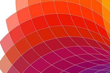
Red relates to these feelings, concepts, and words:
- fire, blood, energy, war, danger, strength, power, determination
- passion, desire, love, emotionally intense
- light red for joy, sexuality, sensitivity, and love
- pink for romance, love, friendship, feminine qualities, and passiveness
- dark red for vigor, willpower, leadership, courage
Use red for coaches who have a lot of energy, for relationship coaches, for romance coaches, and sensuality and sexuality coaching.
7. White for Simplicity and Positivity
White relates to these feelings, concepts, and words:
- light, goodness, innocence, purity, virginity, perfection
- safety, purity, cleanliness, positivity, faith, purity, coolness, cleanliness
- simplicity, high-tech products, charitable organizations, angels
- hospitals, doctors, sterility, medical, low-fat food, and dairy products
If your clients face overwhelm, chaos, and mayhem, then a peaceful, calm, and simple website is a good move. Use a lot of white.
8. Black for Power and Strength
Black represents and evokes the following feelings:
- power, elegance, formality, death, evil, mystery, fear, unknown
- black holes, negative, blacklist, black humor, black death, strength, authority
- very formal, elegant, prestigious, black tie
- black Mercedes, grief, perspective, depth, diminishes readability
- black suit, thinner art, photography, stand out, contrasts, aggressive
Coaches with a power or control kind of vibe common with The Ruler brand archetype can make great use of black.