How to Open Your Coaching Homepage with A Bang – Hero Image
Assuming you’re main goal is to attract new clients, a good goal for your coaching website’s homepage is to:
- build your credibility high as a true professional
- speak to your ideal client’s desires so they know they are in the right place
- and get visitors to start digging into your content
How great would it be to hit on all those fronts the moment someone arrives?
That’d be nice, right?
Well, one way I like do this, is to have a great headshot of you, a massive one (called a hero image) along with a nice and tight write up of what you do – a sentence or two (called your core message).
Let’s check out a few examples and I’ll point out a few neat things about them.
Liz Grant Coaching
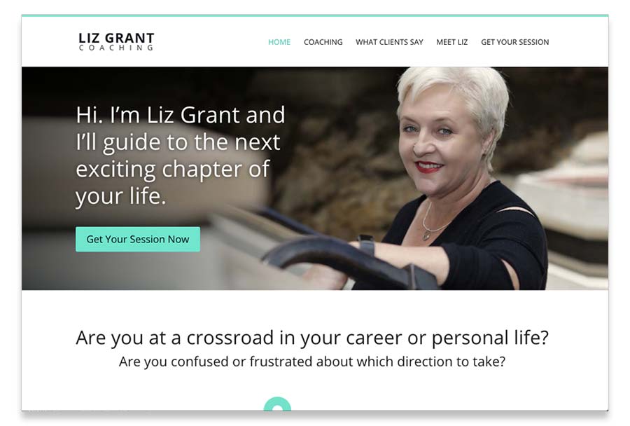
As you can see, we’ve got a message focused on what she can do for the client, creating a new exciting chapter in life.
Liz’s photo is great, clean, clear with a genuine, welcoming smile. Getting a good photo of yourself is what professionals do.
For action, there’s a button inviting folks to click for a session with liz AND there’s a headline below her image which is also another place someone can start reading.
She often coaches folks who are leaving the boating / yachting lifestyle which comes with a massive change – a new chapter in life.
Gideon Hanekom’s Website
Gideon bought my book and built an amazing website from it.
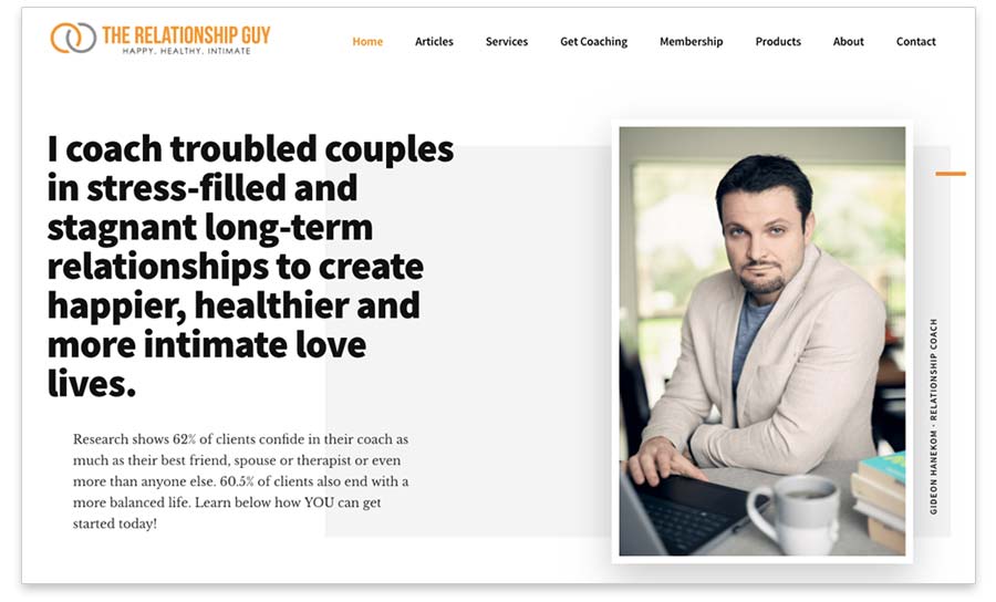
As you can see, he’s got a great message focused on the visitor’s interests and a super headshot.
It’s not exactly a hero image because it doesn’t take up the entire screen, but it is the only image there, and it’s big, so it’s heroic enough.
I’d like to see more of something people can click on or that some content shows below so it tells people to scroll down for more. A juicier next step. Probably take that “Learn below …” sentence, pull it out and make it bright orange with a little arrow pointing down.
Other things I really like include:
- It’s clean and spacious, lots of white.
- The menu is simple at the top, non-invasive, intuitive, and obvious.
- The headshot not only has his head, but a sense of what it’s like to video conference with him. He looks like a seasoned pro.
N I C E
Kenn Schroder’s Website
Wait who? I know that name from somewhere …
Yes, that’s me.
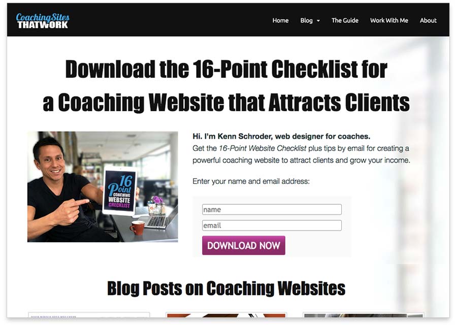
Here’s my homepage and I’m including because it’s a little different in that it has an opt-in form (email list sign up) box along with a free gift when you do sign up.
So this approach does a few good things:
- Puts me and a potential client in touch by email.
- It gives the visitor a free pdf to educate them and further get them familiar with me and what I do.
So this will help me follow up with them.
Lisa Sasevich’s PDF
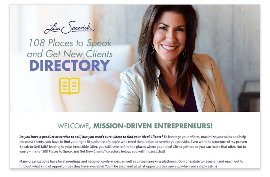
She’s a business growth mentor and I downloaded one of her pdf’s a while back.
I absolutely love the headshot and background in it.
It’s not a homepage image, but you get the idea.
You might think it’s NOT a good idea to have your face on your homepage. You might thing that your website should be “all about the client”.
Or worse, you are too afraid to put up your photo.
But, clients, ones who are going to open up to you, will want to know what you look like. The want to know that you’re someone they can trust.
Furthermore, it’s also a good move to show your mug right away because YOU are the voice of your business. You need to stand up and represent.
Be visible and present. Be the voice of your business.
A few tips for your image
- Be sure to capture some background in your image so your designer can crop it landscape.
- If you can get yourself in action, like coaching a client or giving a presentation, that’d be so guru.
- The side of a building, inside a modern office space or out in nature work great.
- Find an environment that suits your area of coaching (relationships, life, executives, etc).

