Life Coach Sandy Lee’s Website Before and After
I’ve been reviewing coaching websites on LinkedIn. If you want yours reviewed, find me on LinkedIn and post your site. See Coaches Support Group, Blogging for Coaches, and Life Coach Network groups.
If you’d rather not wait, then schedule some quality time with me here, and we’ll find high-impact yet easy-to-do enhancements to improve your website for client attraction.
Here’s some advice I gave to Sandy Lee of www.genesislifecoach.net.
I like:
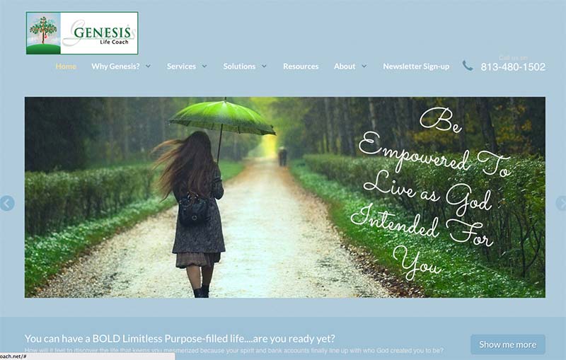
- I really like this, “How will it feel to discover the life that keeps you mesmerized because your spirit and bank accounts finally line up with who God created you to be?”
- The images you have are nice too. Visually nice.
To improve, three things …
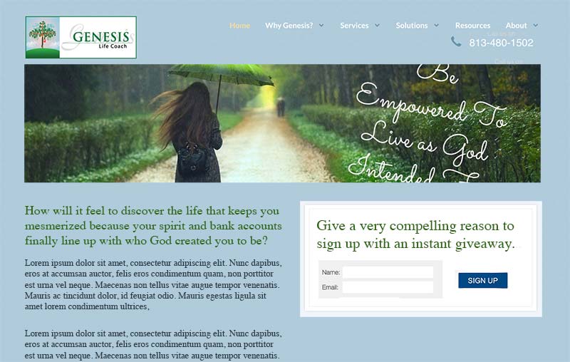
- I would argue strongly that the #1 thing you want to do with new visitors to your site is “get them into your system” so that you can both (1) serve them and (2) win their trust. This is done nicely with an email list. So, get your email list invitation (a) working (it’s currently not) and (b) prominent on the home page, and (c) coupled with a juicy freebie that you give them instantly for signing up. Just think, once you’ve got them happily on your list, they can learn more about your stuff over time. If they aren’t on your list, you’ll probably never hear from them again.
- Get that awesome statement about “How will it feel to discover …” visible, big, and unmissable. At current, It’s nearly invisible.
- You are Sandy Lee, not Genesis Life Coach … so don’t hide behind the name of your business, but warmly, presently, and passionately “be visible” … as “there” as you are when you coach clients. This means not to say stuff like “work with us” when it’s really you and to have your name, face, and personality shine through sooner.
BEFORE:

AFTER:

To get more clients from the web, consider the following:
- Further honing your core message so it sings brightly from the heavens. The basis of your core message can grow from the statement I mentioned above, “How will it feel to discover …”
- Create a golden freebie that captures the soul. Give it to them when they join your list.
I wrote all about (a) how to make a great freebie that both serves your clients and (b) how to fine-tune your message to help others see you as a great option for help as a coach in The Coaching Site Guide over here.
Congratulations on getting a website up! 66% of coaches who attempt to do this either never get it done or it takes 6-12 months or more to do, with much fuss. I’ll add that of the ones that do go up; most do nothing to get clients.

Her website is not updated for the last half year or so.. bad example
Hi Mary. Thanks … how about this month, September? I emailed you direct.
Kenn,
I’ve been watch you for almost a year
I think I’m ready to make whatevery is needed to have a dignified website for my coaching buisness by the end of Mary 2016.
Are your group efforts still available in 2016?
If not, I’ll move on. Thank for the information that helps me choose wisely.
Mary
Hi Kenn,
Useful tips there for coaches like us who own website/blog. I’ve just finished a blogging course and is in the process of setting up my own funnel.
I’ll be sure to bookmark your site too.
Hi HT … great! Gluck on your adventure!
Oh my gosh Kenn thank you! Your timing is incredible. You probably missed a new message I left after my original letting you know that I canceled my too expensive and unnecessary Infusionsoft acct ( for my current needs and abilities ) and have decided to rebrand to Sandy Lee Coaching.
Here is the message from a month ago:
[Kenn, I just discovered that all of my offers are gone on my home page. I canceled Infusionsoft so I have to get all of that back up again. I am kind of waiting to rebrand etc since I changed my name to Sandy Lee Coaching (because I have evolved to more than Life Coaching and Genesis Coaching wasn’t available). ]
The reason is that as time has gone by I have found that the people drawn to me and my practice are also small business owners. As they coach with me they awaken to their purpose and self actualization but as a side benefit they also strengthen their business and make more money too!
That being said, I have new colors, a much cleaner look and will totally implement your awesome suggestions. I will get my offers back up and my email sign up. I may message you my design and hope you like it.
Ed Herzog, simplifying is absolutely my plan and many less pages! It took paying someone to do what I asked….which clearly was wrong. I asked for the wrong things just because I was uneducated. THEN I got into a marketing coaching program that told me I did it all wrong.
****Kenn, what do you think of making sure my new template has the ability for my offers and sign up to be above the fold? Again your examples and comments are extremely helpful because this go around I am doing it myself….for now. I would definitely get with you for the next go around and the “professional” site I want.
Exciting times Sandy. Thanks for commenting.
I’d have to look closer at your template. Did you see how many coaches want reviews? In other groups, it’s gotta tally 100.
;D
Oh, I totally wasn’t asking you to do anymore than what you have. Grateful and have plenty to do. I DID ask if it is still super important to keep offers and email sign up above the fold. That’s all. Thanks thanks thanks!
Great review Kenn! I think too many of us get caught up in trying to create a visually beautiful website that we forget about making it user friendly.
I was looking at someone’s website recently…other coaches were gushing over how beautiful it was. And it was beautiful.
But….1) there were very few signup forms on the website and they were difficult to find, 2) there were WAY too many coaching and pricing options. Which made it hard to figure out what was being offered and at what price.
I think the two top rules for coaching websites should be..make it easy for people to get on your list and make it easy for them to understand what you offer and at what price.
BTW, I know you were focusing on Sandy’s homepage but my main issue with her site is that she has 18 pages. I would suggest most websites should be between 5-8 pages max. Simplify, simplify, simplify.
Hey Ed. Thanks for sharing your comments.
Totally agree … growing a list and showing the benefits – and with an easy site.
Ultimately, getting #s of what’s happening behind the scenes (visitors, subscribers, leads …) tells the truth.
Perhaps more material on #s would be good to write about.