LinkedIn Profile Picture Tips for Looking Fabulous
Today, you’re getting five LinkedIn profile picture tips to make you look fabulous and boost your professional credibility as a coach.
Let me warm us up with something I read from The Subtle Art of Not Giving a F*ck (amazon link) by Mark Manson – a brilliant, fun, useful read.
In it, he talks about his trip to Russia, where people spoke bluntly, saying exactly what they thought and felt whether they liked it or not.
Mark found this style of conversation difficult at first because back at home, in the US, many try to be nice, to avoid conflict, disagreement, or anything negative.
But in time, he came to appreciate realism and directness. He felt a sense of trust because people were honest.
But, what is important here is that Mark felt trust.
And online, trust is vital for business.
“Online, where we rarely meet people face-to-face, we form heavy opinions by what we see, read, and watch. It determines who we like, trusts, and follow.”
And if you want others to form a favorable opinion of you, do things that build that trust.
Your LinkedIn profile picture is DEFINITELY, one big impression-maker. Whether you’re seeking business partners, searching for a new job, or marketing your business, it’s essential to look good.
I know it can be a little pain in the butt to dig through a mountain of files to find your old photo, to make time to get a new headshot taken and to figure out how to upload it correctly.
But, like getting the right interview outfit, a good photo will boost your confidence and impress others.
By the way, guess where people go after they check out your profile? Yep, your website. If you want to make a powerful impression and presell those curious folk about your services, best to make your website stellar. I wrote about that in The Coaching Website Guide. Check it out.
What a Bad or Missing Profile Picture Says
In the past, I didn’t think much about LinkedIn profiles that didn’t have pictures. I just figured it was a new user, and they’ll get around to it eventually.
But, in chats with recruiters, hiring managers, and people who were looking for a coach, a missing photo means:
- You are too lazy to get a good picture of yourself (doh!)
- You are not smart enough to upload it to your profile (wow!)
- Your profile is a fake or spam profile (eek!)
Also, don’t use your company logo, a pet, or an image that is not your face. Not only is it not serving others, but it’s also doesn’t play nice with LinkedIn’s conditions.
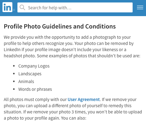
I personally ignore any connection requests that don’t have real faces.
So, if you are going to exist on LinkedIn, you gotta get your LinkedIn profile picture up to snuff.
Does your LinkedIn profile picture have to be fabulous?
Yes. Like this …
I don’t think many will compare to the superstar celebrity, Miss Piggy, but yes, your LinkedIn profile picture should be a great headshot.
If you don’t have a good photo, here’s an article to help, How to Take a Great Headshot. And for some technical specifics about your photo, like dimensions, see the official recommendations by LinkedIn.
Last week, I polished up my LinkedIn profile picture, cover image, and some content. It was interesting how things had changed since my previous update many years ago.
So, let’s dive into those LinkedIn profile picture tips and make your profile stellar …
LinkedIn Profile Picture Tip #1 – Smile From Deep Within
Unless you’re a drill sergeant fitness coach needing a harsh look or an edgy diva business coach wanting a serious stare, go for a warm, trusting, approachable smile.
You tell a smile is genuine when the mouth is slightly open (not gritting), and the eyes are squinting. There’s smiling in the eyes, not just the mouth.
For example, in the picture below, my mouth is closed, and my eyes aren’t wrinkled. That shot did feel somewhat posed.

In this one, however, I was laughing at myself because of how ridiculous I felt. As a result, a real feeling of joy came through on my face. That’s good.

How do you get into a warmhearted state?
- Watch funny video clips.
- Do any short compassion meditation or similar.
- Feel your heart and send good vibes to a loved one for a few minutes.
- Fake laugh until you are genuinely laughing at yourself for fake laughing.
- Tell your camera person to call you a sexy bitch.
From work with clients over the years, eye contact is preferred overlooking in another direction, and a slight head tilt is appealing.
If it’s time for a new LinkedIn profile picture, make sure it’s fabulous with a killer smile.
LinkedIn Profile Picture Tip #2 – Position Your Profile Picture Properly
Get your head towards the top of the circle and just down to your shoulder. Like this …

Don’t put it in the middle or at the bottom of the image because it looks too low, as shown here…

And in this one, there’s too much body making the face harder to see…

It becomes a real problem in discussion groups or when you post articles as your face will be very tiny.
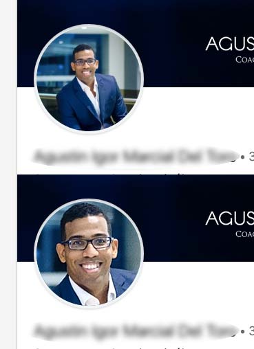
Here’s another quick example showing how much a better a zoomed-in profile picture looks.
Which one of these two looks better to you?
LinkedIn Profile Picture Tip #3 – Make Sure It Looks Good Small
LinkedIn uses a tiny version of your photo in many places, like your news feed, and in group discussions.
If you keep your face prominent in the circle mentioned above, it’ll look decent.
At the moment, the small images don’t look good, but I expect it will improve in time so you can see faces better.
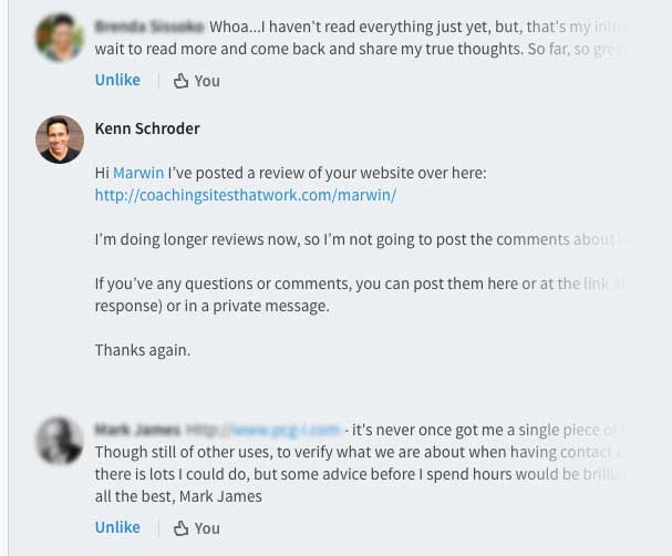
Here’s my photo in a group discussion. As you can see, the image is small.
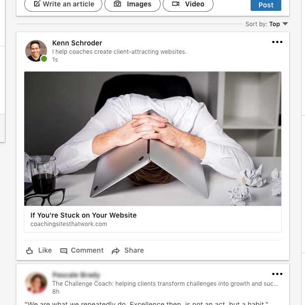
Here’s my photo in the news feed – also tiny.
When you do upload your photo, LinkedIn will let you resize and reposition it.
I expect in the future, they’ll increase that small icon-like thumbnail, and all will be better.
LinkedIn Profile Picture Tip #4 – Choose a Fitting Cover Image
The cover image is what appears behind your head to the top of your profile.
For mine, it’s the laptop and coffee which fits my laptop geek look…

How did I arrive at this stellar photo? A few things I considered …
- My ideal client and what would appeal to them – in short, professionalism over salesy-ness.
- My brand, which is my promise to make websites simple and fun.
- Visually, I use images like coffee, laptops, with nature, and people.
Some tips for finding that perfect cover image …
- Look on your website for an image that you’re already using.
- Revisit your brand, tagline, and marketing message for ideas.
- Try for something subtle, witty, and dramatic. Avoid cheesy, over-used, and boringly obvious.
If you’re big into direct sales and want to litter your cover with messages, just make sure the text legible. Then test it out, of course, and see if that approach delivers the results.
Also, know that your cover image will be shrunk down for use in various places like your articles and posts page, as shown here …
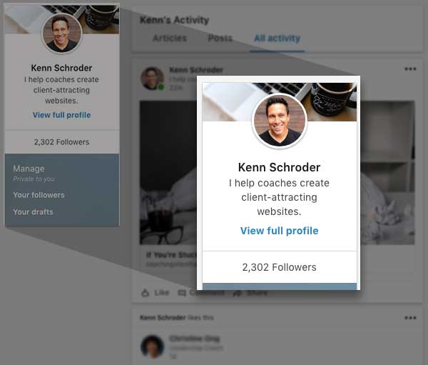
The laptop with a coffee photo by Dan Gold on UnSplash.
I found my fabulous image on UnSplash.com, which has free images for any use. They ask you to attribute but don’t require it.
I also use BigStockPhoto.com, which has a substantial collection of inexpensive images.
More free stock photos for your coaching website here.
LinkedIn Profile Picture Tip #5 – Check Your LinkedIn profile Picture on Your Mobile Phone
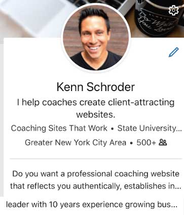
Double-check your photo and cover image on your cell phone.
Just last week, I got back from my geeky WordPress group, and the presenter on SEO (search engines) quoted that 75% of website visits are on mobile devices. No surprise there, but a good reminder.
I had a small tech issue as my profile picture is coming out like garbage. It got me all in a frenzy to fix it. But alas, some tech hiccups take time to sort out.
As you can see, my brother’s profile picture looks good on my mobile.

I looked at my profile on my iPhone 6s, and sadly the image was quite blurry – not suitable for a web designer. It’s been six hours of hair-pulling. I could use a hug.
The long and short of it is to get a photo with a good, warm smile on your face, and when you upload it to LinkedIn, make sure your face is visible.
Don’t have your mugshot yet? Tsk, tsk! Read this post, How to Take a Great Headshot.
Post Your Thoughts and Ideas Below
I get a small hit of happiness when I know folks are reading my material and finding it helpful. Let me know what you think in the comments.


Great. Thank you for your tips. I have changed my profile picture on LinkedIn.
Nice job. I learned a few things from this. One other tip I’d suggest. Once you’ve got your new profile pic use it everywhere, consistently, in all your branding. I see people use a mish-mash of profile photos in different places. One other thought. I have two profile pics, one smiling and one serious. In most cases, I use the smiling one. But, for instance, in my About page, I’m talking about the death of my mother. I use the serious-looking photo in that one. It’s nice to have that option, in certain situations. But on Linked-In, yeah, you nail it in terms of the advice you’re giving. I especially like the “what not to do” example photos.
Hey Tony. Great to see you here. That reminds me. Here’s a quick list of the places I had to update.
* Facebook Page
* Blogging Membership Group
* Gravatar
* Skype
* Gmail / Google
* Twitter
Hmmm … I know there are more.
What’s very interesting is to scroll through connection requests, if you get a lot, and see what you like and don’t like. It’s eye opening.
This article is full of info and fun Kenn.
My suggestion: Get a professional picture done and keep
Miss Piggy (so fabulous) available to cheer up a frustrating
day with technology!
🙂
All great tips Ken. I also think it is important that a photo is reasonably up to date and honest (no airbrushing:) so that when your clients actually meet you in person or by Skype they don’t get a surprise to find you older and more wrinkled that your profile photo.
There sure is a credibility minus when that happens. I’ve heard stories of dating profiles that use fake photos. Eeks!
Great article and the images make it even better. Thanks for that (although I already knew it)! But it’s always good to see that others like quality too.
Thanks Kirsten. I see you’re a stone’s throw. It might be time for a cuppa catch up.