Client-Attraction Tip for Meagan
To improve Meagan Saum’s somatic coaching website for client-attraction, here are before-and-after images along with my suggested tweak.
If you want me to review your coaching website schedule some quality time with me here and we’ll find high-impact yet easy-to-do enhancements to improve your website for client-attraction.
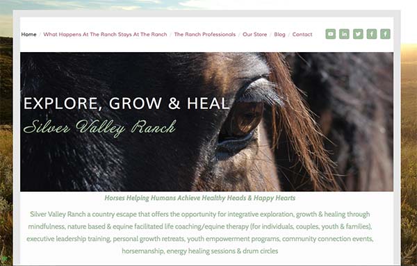
Here’s the before screenshot …

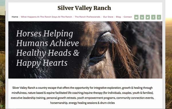
Here’s what I’d do to improve …
I like the dramatic horse picture. Really attention grabbing and interesting.
People get lost on sites quickly and commonly struggle to understand what a site is about. That’s what happened to me when I arrived at the home page.
To avoid this challenge, I recommend putting your logo at the top along with a tagline that says what this site is. (It might be obvious to you because you made the site and it’s your business, but to others, I predict it will be confusing.)
Here’s an image of what I suggest …
Here’s the after screenshot …


Kenn, I am currently redoing my site based on your recommendations. I have a question…the site designer wants to have an emotive picture as the first thing the client sees and then below that my photo and the rest per your suggestions. What do you think of this idea? My current website is listed below but not a good representative of what the next will be. Here is one of the proposed images.
https://s3.amazonaws.com/storyconsulting/suggested_image.jpg
Thanks for your suggestion Kenn! I look forward to cleaning up my website and making it clear for current and potential clients! Your suggestion is greatly appreciated.
Kewl!