Three Keys to an Attractive Coaching Website Header
If you’re building a coaching website and are aiming to build up your guru image so that people will see you as smart, intelligent, caring, and authentic – essentially a great coach, your website header should include these three elements.

Before I go into them, let me remind you that when clients hire coaches, when they are wondering if you’re the kind of person they want to work with, two of the big-ticket things they want to know are:
(1) that there are big, worthwhile reasons for investing their time and money — Results.
(2) that you are the kind of person they could, would, and should work with — You.
The first thing – A big ole benefit
People invest their time, money, energy, or attention on things that bring value. We all want to improve, fix, change, grow, and experience things in life that enrich it.
There must be something worthwhile, a promise, a possibility, an ideal to strive for. If your site says, “I’m a coach. I do coaching. Hire me”, you’ll have a tough time.
Unfortunately, your website domain name, business name, or even logo may not highlight big enough value. You’ll need to dig deeper into what your clients really want.
If you’re a general coach, mix in a few benefits. A client of mine works as a health coach and her benefits include “feeling great, eating well, and losing weight”. She combined a few key benefits to make coaching with her worthwhile.
In your header, get a big ole benefit in there – or a few that spell out something people really want. Here’s an article to help, Coaching Website Mistake: No Big Benefit.
The second thing – Your face with a big ole smile
Part of your marketing and branding is “you”. Like it or not, the decision to work with you as a client will have loads to do with who you, the coach, are.
Don’t get too hung up on trying to come up with a “core concept” or “business name” that’s so cool people will hire you. It doesn’t work well. I’m referring to you coaches who are busy trying to sell “true self-coaching” or “enlightened life coaching” as your main benefit. While these concepts help teach and communicate, they don’t replace “you”.
So, when it comes to your header, get a great shot of you in it. Get a face that has a smile, eye contact, nice hair-do (unless you mentor young Albert Einsteins ;). You want a face that says, “I care about you. I’m serious.”
With your face, including your name and title (business coach, success mentor, etc) go with it so people know it’s you. How to Take a Professional Coaching Photo that Connects.
Let’s go beyond your header and create a guru-like website – the kind that clients love!
There are all kinds of strategies for getting a compelling message across to your website visitors.
I put them all in the sweet guide that I wrote, The Coaching Site Guide.
You’ll get my best tips for everything from content creation to visual design, to technical setup, to generating new leads.
You’ll be pleasantly flabbergasted when your site goes up, and people start contacting you. 😉
The third thing – your business or website name
This is less important from a marketing point of view but important from a reference point of view. People need to know they are the website they intended to go to. Your website address and business name (ideally the same) are clearly findable at the top of your page – in the header.
You should keep your header consistent through the various pages of your site so people know they are still at the same, right place.
You may have landing or sales pages with one main call to action that won’t have a header or menu so that you can convert more sales. If so, go for it, test it out, and see what works best for your pages.
But, the main point, is to make sure your header indicates where people are.
Some examples

As you can see, this has the benefit of “Eat well. Lose weight. Feel great!” and has Shaunna’s face. She’s got a great smile that says I love what I do, and I’d love to help you too. Also, here website name is clear so I know where I am, “Canadian Health Coach”.

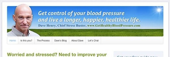
Dave’s got a great header too. His face is prominent, with good eye contact, a subtle smile, and a benefit statement that many men want – control over blood pressure and health.
In conclusion …
If you want to attract clients, position yourself as a great coach (guru, expert, mentor, leader, etc) then make sure your header supports that – that it stands for something big and you stand right there with it – ready, wanting to help.


You have a lot of great advice here for coaches. Thank you! I’ve worked very hard on my own site, but as soon as I think I’m finished, I find something that I want to upgrade! It’s a process.
http://oracoaching.com
Enjoy the process … (I’m getting better at it myself).
“Power up your leadership presence” … ask your leaders what they’d love to “get out of powering up” … that might help you sharpen up this tagline. The real way to know if your tagline is good, in the end, is if they (your ideal client) starts to drool when they hear your tagline.
😀