
10 Traits of a Coaching Website That Works
Most websites of coaches just collect cyberdust.
They don’t do more than add a line on business cards or a link in profiles. This is what I’ve seen in 25 years of building websites, mostly for career, executive, and life coaches.
Better would be a website that MEASURABLY grows your biz.
One that brings traffic, gives you new client leads, grow subscribers, gain members, or otherwise sells your coaching programs. Yes, legit biz growth.
IN THIS BLOG POST, let me share 10 keys to a coaching website that works to bring income-producing results to your coaching business.
Trait #1 – Your Coaching Website Serves a Tangible Purpose
Many new coaches feel the need to have a website simply to appear “open for business.” It fills a spot on their business cards or serves as a link in their profiles. Without it, they might feel as though they aren’t truly legitimate, or worse, they’re left awkwardly saying, “It’s under construction” when asked about their site.
Unfortunately, many coaches cringe at the thought of someone actually visiting their site. They rush to build an overnight website using platforms like GoDaddy, Wix, or Weebly. The result? A generic template filled with the typical “What is coaching” copy and cheesy stock photos.
They might slap on a logo and a photo, even if it clashes with the design, and call it done. But the site feels disjointed, doing little more than confirming that “the coach has a website.”
Instead of building a site just because “everyone has one,” focus on how it can actually help you attract clients. Think about how your website can guide visitors toward taking concrete steps to hire you. Identify specific actions you can track and measure.
Kenn Schroder
Some ways you can measure your site’s effectiveness:
- Generates new client leads: Track emails, form submissions, or calls.
- Increases traffic from search engines: Use analytics to measure site visitors.
- Grows your email list: Monitor the increase in subscribers.
- Boosts social media followers: Track your follower count over time.
- Brings in referral partners: Measure inquiries about partnerships.
- Increases sales of courses, programs, or books: Watch your bank account grow.
- Leads to more speaking engagements: Track inquiries to present or speak.
For example …
On this website, I have a big button at the top that invites you to Get In Touch with me for help. It goes to a page with a simple form — a call to action.
I can easily measure the number of times people fill out that form and thus track how well my website is performing.
If you can measure it, you can improve it.
Trait #2 – It Impresses the RIGHT Person
And that ain’t you!
While you may fuss a lot about your website — like finding great images, creating an artistic logo, or scouring for inspirational quotations — it won’t be an exciting website unless it’s appealing to …
… drum roll, please …
THE VISITOR!
By visitor, I’m referring to the “target client,” “target market,” “best client,” “avatar,” or “audience” — other similar phrases for this special client.
After all, your visitor is the decision-maker. She’s the person deciding whether or not to follow you and ultimately work with you.
How do you focus on the visitor? That’s all in the content.
Here are some great ways:
- Share articles about how to overcome challenges
- Write about how your approach helps her realize goals
- Share how your experience, skills, and talents help her
- Avoid confusing concepts that aren’t relevant to her
- Make your content easy to follow
- Offer clear action steps to engage with you (forms, email list, etc)
While you definitely should have a website that you FEEL GREAT about — it’s more important that your AUDIENCE loves it.
Focus on your ideal client!
MY BOOK HELPS YOU FOCUS ON THE VISITOR
Though I started as a techie web designer, I couldn’t make great websites unless my clients could create good content. So, I wrote a book to help, The Coaching Website Guide.

Trait #3 – Your Site Builds Your Credibility High (Five Good Ways to Do It)
Coaching often gets into personal stuff. Clients may have to get vulnerable to discuss deeply personal challenges, goals, and fears. They must trust that you can provide a safe space to work together.
It’s funny! Lots of coaches tell me stories about how their clients show up with “presenting issues” — like misbehaving children or lazy employees — but eventually, coaching lead to the discovery that the problem “isn’t the other people.” Heh!
And, of course, we’re drawn to people who deliver results. As people check you out at your website, they want someone who knows what they are doing and has a track record of success.
Five ways to build credibility high:
1. Share client success stories.
Show how you help them find answers in not-so-obvious places.
And how changes happen for the better.
2. Explain your approach powerfully.
Talk about your method or approach that leads to success.
Creating a handy diagram can do wonders for showing value.
3. Show the value of your experience.
In addition to simply listing out your experience, training, and certifications, try telling a story where why not tell a story that shows your skill in action?
4. Talk about your client’s needs deeply.
On your services pages, list the problems you help with and the results you achieve.
Make sure the content on your About Page ties into benefits for clients.
5. Create content that helps people think better.
Videos, articles, and materials that help people see their challenges in a different (better) way are powerful — one can feel change happening instantly.
A credibility power move …
A more subtle but powerful way to build credibility is to offer an email newsletter. This commitment to show up and serve your audience over time wins trust. This is why so successful pros do it — and recommend it.
I LOVE IT when a coach message me from my email list with credit card in hand, ready to go.
I will admit, it’s a little odd though — because in our first call, they know me very well and I have no clue who they are.
So it takes a few minutes for me to complete the connection.
🤓 😎
Trait #4 – The “Visually Vibe” is Appealing
When choosing colors, images, and textures, ensure they all fit the look and feel you want. Consistently use the same colors, shapes, and fonts across pages.
Is it a classy, girl-boss urban feel for women managers in corporate offices?
Or perhaps you’re an office worker who wants to escape the suit-and-tie life, and make a remote income in jeans and t-shirts.
It’s like going into the Starbuckses around the world — the experience is consistent, comfy, and familiar. We trust Starbucks.
There are lots more visual design tips to make your website look great to your prospective clients in The Coaching Website Guide.
Trait #5 – Your Website Sells the RIGHT THING.
And it ain’t coaching.
Clients are looking to go from where they are now to a better state in the future — be that in relationships, their careers, health, or some other important areas of life.
They want to change, transform, or succeed with their current challenge. They want a PERSON who can help them do that.
And while coaching is a tool you will use, the reason they become a client is all about YOU as the agent of transformation.
You’re selling YOU.
HERE’S A CHALLENGE …
Try removing the words “coach” and “coaching” from your website. Does it still read normally?
Can you talk about what you do without using the word “coach.”
If so, you’re on the right track!
THREE TIPS FOR SELLING YOUR SOUL 😉
So, how can we get away from explaining coaching on our websites? And instead bring out some of the value of working with you? Here are a few …
- Show how you’re not just different than other coaches, but different in a valuable way.
A career coach who has succeeded in four different careers is a powerful testament. A career coach who turned vegan, not so much. - Sharing life lessons from difficult challenges in your life (that lead to becoming a coach) communicates wisdom. You bring valuable experience to your clients.
- Share your unique talents, skills, and experiences related to your coaching. Like having worked in many countries would appeal to global enterprises.
There are many more ways to get clients excited about working with you in a book I wrote, The Coaching Website Guide. People like the chapter-by-chapter, page-by-page guidance for writing.

Trait #6 – The Content is Easy to Consume
In reviewing hundreds of websites, one of the biggest problems is hard-to-read content. If your site is difficult, people won’t stick around to see how awesome you are 😉
One part of the problem is boring content, a very big topic. I wrote a lot about this in The Coaching Website Guide, and in this article, 29 Things Clients Love to Read About.
The other part is POOR READABILITY, like:
- long bulky paragraphs
- fonts that are too small
- text that’s too grey
- words on top of backgrounds
To see what WORKS WELL, check out your favorite bloggers. They use:
- dark text on a white backgrounds
- large font sizes
- plenty of headings and sub-headings
- very few fonts, colors, and sizes
- short sentences and paragraphs
Online, people read fast, unlike with books. They skim and scan and gulp down quickly. So, make it easy — like downing popcorn at a movie.
For example, here’s the same advice in big text, grey, tiny-font paragraphs …
I’ve reviewed hundreds of websites, and one big issue is content that’s hard to read. And if it’s difficult, people won’t spend a lot of time on your website to learn about how your coaching can help them. And that’s bad for your marketing.
To see what works well, look at your favorite writers and bloggers. You’ll notice their posts are often dark text on a white background and written in large font sizes. They also use clear headings and subheadings with only a few fonts, colors, or text sizes. Their sentences and paragraphs are shorter than what you’d see in printed books.
Online, people read faster with more scanning and in less time. So think of it like eating popcorn at a movie instead of sitting for a big dinner at a wedding. Remember, if it’s hard to read, people will spend less time at your website — and not learn about your coaching awesomeness 😉
Trait #7 – It’s Simple to Update
Oddly, I still run into a few instances where a coach has a website built and pays quite a bit for a professional designer to make simple text edits. This shouldn’t happen.
In the amount of time that it takes you to compose an email with changes for your website copy, you would be able to do it yourself.
I love WordPress because with a few minutes of training, you’ll be able to get in quickly and access website copy.
Some things you’ll want to be able to quickly tweak on your website:
- add / remove a page
- change text
- insert images
- update your menu
- email your list
- publish an article (blog)
- manage comments on your blog
- update email messages
- edit testimonials
A coaching site that works will save you time (less back and forth) and money when updating the small stuff.
Trait #8 – Your Coaching Website Builds The Relationship
I know we all hate the word “sales”.
Me too.
Having to “sell someone” on anything is a big turn off.
But in so many years of helping coachings with their websites and then onto filling their practices with clients, I’ve come to see this dirty word “selling” in a different way – a better, more genuine, positive way.
Selling is really about working for your client, creating a lot of value for them, and serving them in a big way WHILE you also look out for your income needs and respect your time. It’s about forming a good, productive relationship with clients.
It’s about honesty, trust, respect, and mutual gain with clients.
And it’s about taking ownership of the effort involved to find the fit and lead you two to be happily “working together.”
Kenn Quote
If you can see it from that angle, I think it’ll do a lot.
When it comes to your website, you’ve gotta have an underlying strategy or process for finding and signing up new clients – a process to get you two talking and then working together nicely.
Your website will play a part to get your name out there – where potential clients learn about you, leading them to contact you – wanting to work with you.
Different coaches will do things differently. Ideally so since they oughta leverage their talents and resources to grow their businesses.
Just make sure you think about your website in context — having a process to build a positive relationship as you seek new clients.
Speaking of strategy, here’s one way to get coaching clients online.
Trait #9 – It Looks Great on Mobile Devices
In September 2019, 34% of the visitors to CoachingSitesThatWork.com were coming from a mobile device.
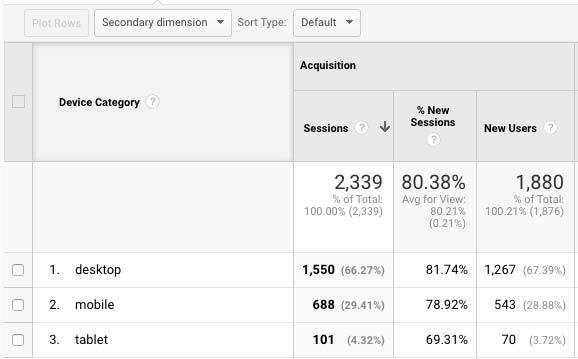
On closer inspection, you can see most of the mobile users were from iPhones and iPads.
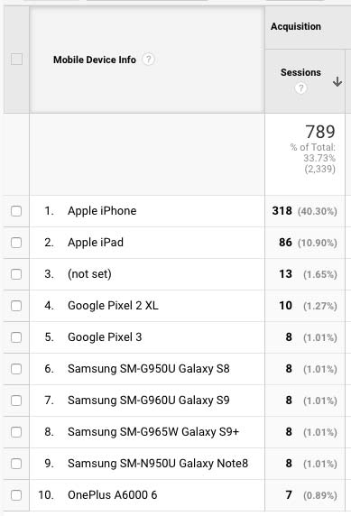
Needless to say, I own an iPhone and iPad and those are my first places to test website designs.
If your website has been around a while, you might want to double-check it on your phone.
Trait #10 – Your Coaching Website Doesn’t Suck Up A Lot Of Time
Whether you hire someone to build it, do-it-yourself, you absolutely CANNOT let your coaching website drain your time.
I see this often.
Coaches start out wanting to create the coaching business of their dreams. And so, with a family and full-time job, they allow some spare time to start working on their websites. Half a year goes by, and they end up becoming a worse-than-novice web designer instead.
Don’t let time disappear because you have other pressing matters:
- Getting marketing (visibility, traffic) strategies in place
- Having phone calls with prospects to convert them
- All sorts of administrative tasks
- And let’s not forget to make time to coach people!
It’s easy to fall down the website-creation rabbit hole because there are so many bells and whistles to play with, and playing with them is fun.
Also, tech hiccups can throw you for a loop, not only wasting time but giving you greys.
Did I mention copy? That needs to be written too – and written well!
So, you’ve got to keep the big picture in mind – marketing and finding clients and realize that your website is just a part of that.
Get it up, get it going, just what you need, hand it off to someone to manage, and avoid wasting time.
So, does your coaching website work?
Wuddya need to fix it?
I’d love to hear what thoughts and ideas are coming up for you as you build and enhance your coaching website.
Post below, and include your website address for that little SEO boost.
Thank you Kenn.
Thanking your guide I published my first website in 3 weeks. It is no perfect, but it can grows with me.
There are some limitations, such as the blog comments, and the lack of one more level of pages so, being an Italian/English wsite, it has the main menu in Italian with the option to go for English.
Thinking in terms of visitors need, my quick bio + pic is not at the top, of home page.
If you and your readers want to give me a feedback, I will appreciate a lot,
Thank you,
Angie
https://www.angieclaire.com
Thank you Kenn for your you professional view, comments and feedback on my website. I think most of us need feedback from time to time, get that second and third opinion as it is how others see us gives a clue to how we are progressing and what is very good, but what might benefit a change. Furthermore, what might have been good 6 months ago, may need a change to remove or to update. It is easy to be set in our ways and say it is alright, ask the question is it alright. I for one will be making several changes.
Hello Lawrie,
Just reading your comment, if you wish to share some feedbacks, it will be my pleasure!
Would you like let me know your?
I have 2
https://www.angieclaire.com
https://www.cleanlifeprogram.com
Looking forward to hearing from you,
Best wishes,
Angie 🙂
Thanks for the Resources. I was looking for a “best practices” on how to set up the buy now coaching page so that I can offer Strategic planning coaching right away. I haven’t found it yet, but I’m sure I will.
Cheers!
Hi
Just starting out with my proffesional Company, and find your page here so Incredible useful. Thank you so much for sharing all this with us.
I’m in the process to buy som WP theme pages, and really value your input.
Thanks!
You’re welcome Margreet.
I am grateful for the expert advise you share. I am in a DIY mode in start up for the site which is still under construction. I have a small client base but I am passionate about this venture. Thank you Mr. Shroder.
Great Violet. Best of luck on the journey. Lots of blogs here and also a handy, all-in-one-place step-by-step guide with writing formulas coaches love in the guide I wrote. Details here: http://www.coachingsitesthatwork.com/guide (PS. get on my email list for more goodies).
Dream.
There are 50 shades of grey so … deepends on how dark you want to go. 😉
Uhhh .. I mean black is good, but black on white can be contrasty/harsh on the eyes. So a near-black is what many sites use. It’s easier on the eyes.
Try out your very dark grey and share your site with a few people, see what they think.
Also look at google, linkedin or your favorite blogger sites, you’ll quickly see what font sizes, colors are great for the body text.
Thank you, Kenn, for this clarity about a working website. I am very new to putting up a website.
I am wondering about using grey instead of black for text.
I find that when reading grey, I am straining to read the text.
Doesn’t happen with black.
Can you explain the reasoning behind using grey? Thanks again.
Kathleen
Thank you for a great article! Valuable information, clearly stated and action focused! love it!
Hi LeAnne … great to have you here and thanks for the positive words. I hope you found value here. Which of the above did you find most helpful?
Cool … great to have you Emily. Nice clear profile picture. One thing to toss your way, a bulk of your market may be up and coming artists, little $$, so consider a low end price point product/service that has juice but also doesn’t take much of your time to deliver.
Great to have you by.
You are amazing, I’m a Life Coach setting up my site to work with performing artists and you helped me solve a last minute change to the homepage! Thank you soo much! My eye is on this site! 🙂